Blue And Yellow — Taking Part In 2022 Photo Competition; Part 3
Welcome to the third part of me taking part in a year long photo competition. If you want to read more about what this is about I welcome you to read the first part.
The original theme for March was supposed to be about night photography. I don't remember the official name for it but photos that have something to do with night would fit. In any case, the theme was changed to "Blue And Yellow" to spread some love towards Ukraine, which at the moment is experiencing awful things from its neighbour russia.
I was quite looking forward to the night photography theme but I still support the theme change. Even if it meant that the small plans I had for night photography had to be scrapped. I can't say I had any concrete things planned anyway so there is no great loss there. And it's not like I can't take those photos outside competition anyway.
I must say that I struggled with the new theme. This time it wasn't due to me not having enough time to take photos. I took quite a lot of photos during March but I didn't take many photos that I considered fitting the theme. "Blue And Yellow" is open enough that it shouldn't be too difficult to take a photo of something that fits it. Like a yellow flower against a blue sky. Or a yellow chicken against a blue sky. Or a yellow cat against a blue sky. Basically anything yellow against a blue sky would fit. That didn't seem good enough for me. I wanted something that would relate more to Ukraine. Something that has some emotion. Sadly I can't say that I succeeded in finding this in my photography.
With me failing to deliver some emotion in my photos I went back to a more open interpretation of having something yellow and blue in the photo. Because the original theme was about night photography — which I was looking forward to — I thought that I would do some light painting. I hadn't done it in the past. I haven't done much night photography in general. Not because I dislike it but because I dislike tripods and standing still. I'm more of a move around a lot kind of photographer. That said I still have a cheap tripod so it is possible for me to take long exposure photos.
First problem was finding a way to light my subjects. I don't have a strong flashlight and even if I did — how would I get it colored? My first thought was using an iPad screen. Put a blue or yellow color on the screen and use it to paint that color onto whatever I'm taking a photo of. This didn't go too well. The iPad screen doesn't produce nearly enough light to paint a subject at night. Maybe you could do it for some smaller subjects but not for the things I wanted to color. I had to get a flashlight. Which I did.
OK — I have a way to generate stronger light now. How do I make it go blue? I ended up shining the light through color filters meant for black and white photography. I have a set of filters in all the relevant colors. I used the blue filter for the blue sections and yellow filter for the yellow ones. It worked out a lot better than the iPad but I still wasn't happy. First, it's a pain to do. I couldn't light my subjects during a single exposure so I had to take multiple photos and merge them using exposure stacking. Second — I couldn't find an interesting subject to light up. In the end I took one photo that was decent enough to look at but not good enough for a competition. You will see it a bit later.
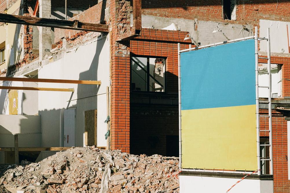
In the end I ended up doing what I usually do. Walk around to try and find things that fit the theme. Both of the photos I submitted were taken on the same day. During the same walk. One was with an Ukrainian flag next to some building demolition site. It seemed to go together pretty well as sad as that is. Second photo was something yellow in front of an actual blue sky. It's an OK photo but it shows no emotion against what is happening in Ukraine so I'm not too happy with it in this context.
So there we go. Third month in this competition has not been too good to me. Second month with the theme "Minimalism" was definitely better. I also feel like next month's theme won't do me any favours but we'll see. I might surprise myself. But probably won't.
You can enjoy ( or not ) some of the photos I considered for the competition below.
- Camera
- Sigma DP3 Merrill
- Lens
- Sigma Lens 50mm f2.8
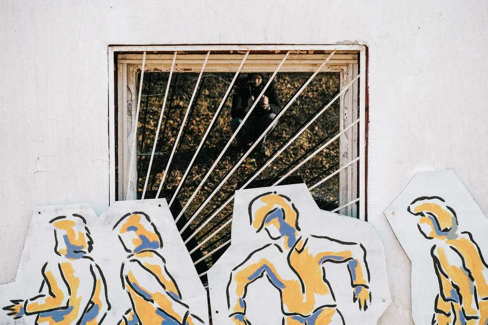
I like this image in many aspects apart from me making a cameo in it. A rookie mistake of not noticing that I am part of the reflection.
- Camera
- Sigma DP3 Merrill
- Lens
- Sigma Lens 50mm f2.8
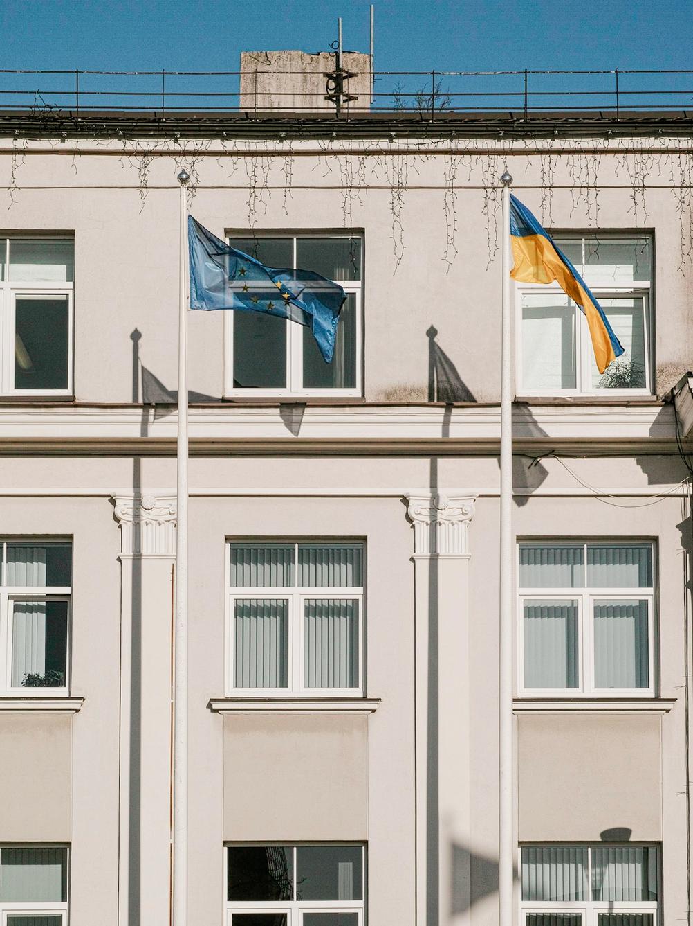
This is a very direct take on the theme. I don't dislike this but it seemed too simple.
- Camera
- Sigma DP3 Merrill
- Lens
- Sigma Lens 50mm f2.8
This was taken at the same place and time where one of my submitted photos was taken. The framing is completely different though.
- Camera
- Sigma DP3 Merrill
- Lens
- Sigma Lens 50mm f2.8
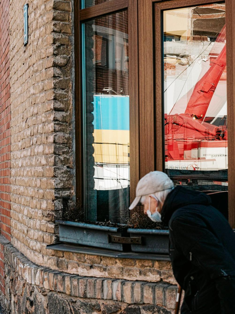
A very different take on the same scene. I like this photo and was torn between it and the one I ultimately submitted. The other one seemed more of a "crowd pleaser" type photo.
- Camera
- Leica M9
- Lens
- ZEISS Biogon T* ZM 35mm f2
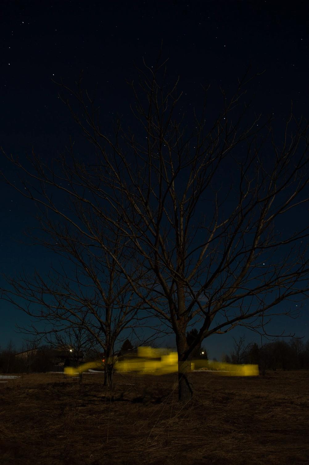
After seeing that I can't color anything with an iPad I thought that I could do some light trails. It's fair to say that it turned out horribly. I didn't even go back to do a blue trail.
- Camera
- Leica M3
- Lens
- ZEISS Biogon T* ZM 35mm f2
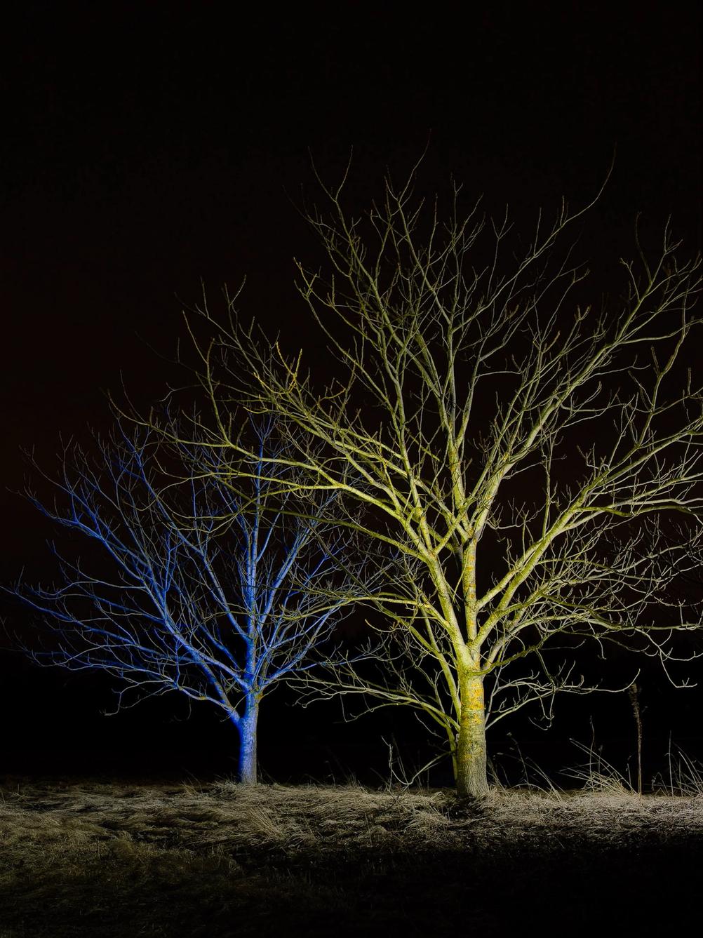
This was lit with a flashlight through yellow and blue filter. It's a combination of 3 or 4 photos. 1 yellow tree, 1 or 2 blue trees and 1 with neutral color to add texture and more detail.
In the end it doesn't look too good.
- Camera
- Leica M9
- Lens
- ZEISS Biogon T* ZM 35mm f2
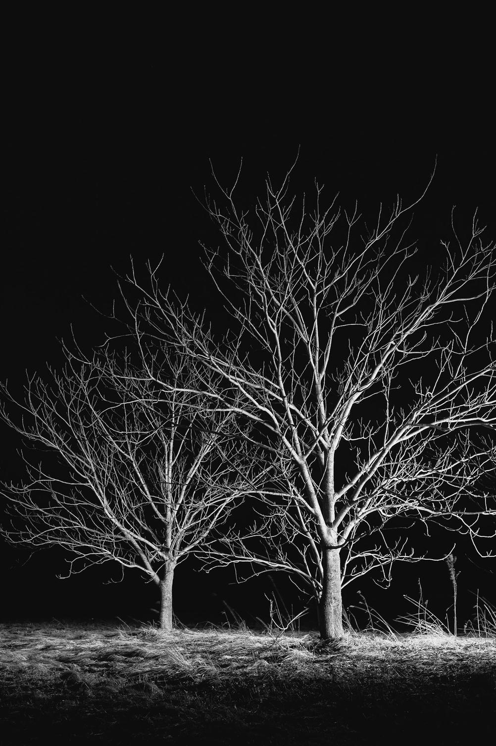
The black and white version I like a lot better but it obviously doesn't fit the competition theme.
This is a single image lit with a neutral light. I like the simplicity of not having color as it doesn't add anything here.
